

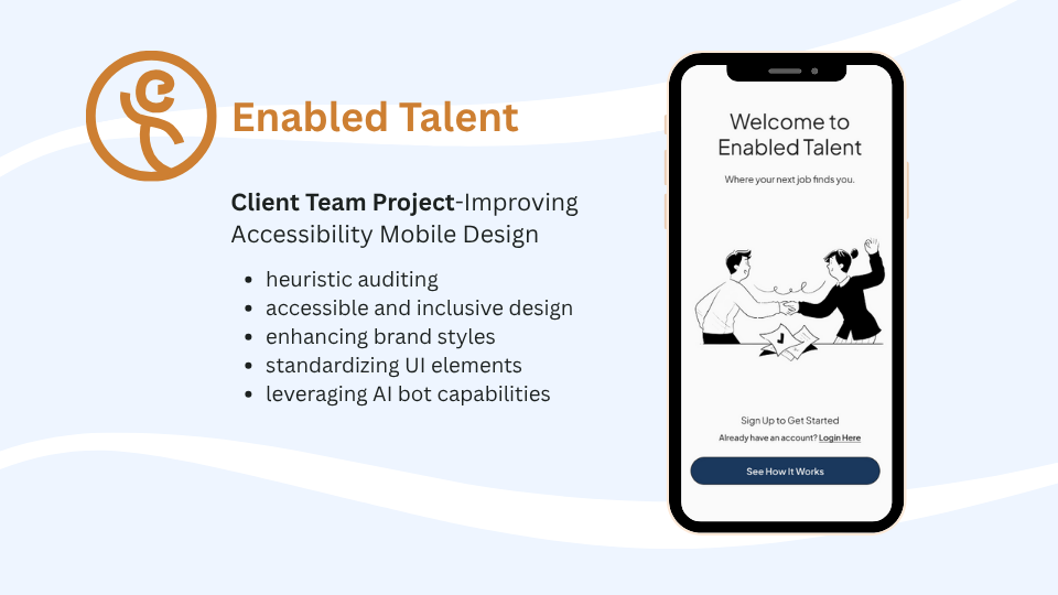
Enabled Talent | Redesigning and Improving Accessibility
A Job Matching Concept for All Individuals and Designing for Better Accessibility
Prompt: Designing Mobile Job Matching Platform with Accessibility
Project Type: Client Capstone, Mobile Design, Redesign
Role: UX Design Student, Team Member 1/3
Duration: 75 hrs + 1 week extension
Project Background & Problem Statement
Enabled Talent is a company that is an AI-powered employment platform dedicated to bridging the disability employment gap. Their aim is to empower professionals to use this hiring system to bring more opportunities and inclusive employers with an accessible and equitable platform.
Enabled Talent’s platform has the opportunity to better support job seekers by becoming more accessible and accommodating for all users. Improving accessibility ensures every job seeker can confidently pursue their career goals. The platform can make the job finding process less difficult by matching job seekers to employers who supports and can accommodate the users job needs.
Project Brief and Specific Requests
The Project Brief
Design and improve the accessibility of the Enabled Talent mobile platform to ensure individuals with all different disabilities can be able to navigate and complete their job searching needs without added barriers.
Client Specific Requests:
Wants a heuristic audit of current website
Focus designing accessibility with visual disabilities/impairments as a focus.
Journey mapping of the job search experience
All designs to comply with WCAG accessibility standards
Keeping resume upload-parsing apart of the onboarding flow
The Research
Research Goal
We want to learn how different individuals and different abilities go about job hunting and what are their difficulties in their process. By learning more from our research, we can find more insight in how we can help make their job hunting flow easier and accessible and inclusive for all types of individuals.
Research Methods
Individual research on accessible design, WCAG guidelines, and how screen readers operate on desktop/mobile devices.
Comparative and Competitive Research to see what competitors hiring platforms look like
User Interviews to hear from users first had of their job seeking experiences.
Contextual interviews, to view how users navigate the current platform.

What I learned with my individual research about accessible design…
Disabilities are not just permanent ones, theres situational and temporary disabilities that effect everyone.
How screen readers work, and tab navigation.
Labeling pages, using descriptive words, and clear language.
Color contrast ratios, standard text sizes, and how these are important for visually impaired and also non visually impaired individuals.
Error messages and Instructional texts are essential to guide users for specific tasks.
Alt and ARIA attributes creates more accessibility for screen readers and other assistive tech tools.

Inclusively Onboarding. This screen shown provided an example of simple, screen reader friendly cards. Also provided inspiration on how to ask for individual accommodation needs for success at work.
Competitor Analysis Insights
LinkedIn’s Accessibility Gap- No accommodation filters, keyword work arounds return unreliable results.
Lime Connect- UI for sign ups were overwhelming, long screens, lots of personal questions, and visually busy.
Ability Jobs- Large inventory (<1M listings) confirms market interest, yet experience is transactional with minimal matching or guidance. Needs accommodation-aware tools. Onboarding is does not include essential information.
Inclusively- (closest direct competitor) lightweight three step sign up, extensive “success enablers” accommodation tags, and an employer analytics product that tracks benefit usage and retention.
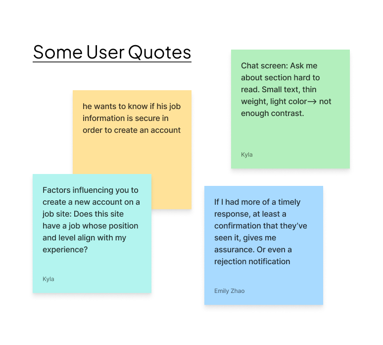
User Interview Insights
Relevance and Efficiency Drive Engagement
Users need platforms with relevant job filters, recommendations clear job preference details, and reducing time for onboarding.
Trust and Transparency Are Essential
Users value trustworthy, transparency in job platforms
Accessibility Benefits Everyone
Readable, high contrast UIs, text sizes are crucial for all
Control and Clarity Build Confidence
Users want control over profile details employers see
Clear labeling of sections/forms
Communication and Human Touch Matter
Users express need for human interaction, communication from employers.

Screenshot of old screens that shows how there are some links that were not linked or interactive to users
Contextual Research Insights
Heuristic Analysis- Found many missing labels (that screen readers would miss) and overall usability barriers and accessible opportunities within platform.
Contextual Interview- We had users go through the current website and go through sign up, profile and the career coach.
Users still were questioning their trust on how resume would be extracted into profile, missing sections on profile, sections that do not provide context. (notes, qualifications)
Progress through onboarding was not reflective of each step.
Sign up had areas that caused confusion. (Get started button, login vs sign up flow, errors in password)
Overall users wanted more control on what would be shown to employers and what items would be optional or not
Users expected a place to view job or matches
Users Personas

Using the 5 user interviews, the personas were developed to understand the users perspective and the common pain points from the interview and contextual research
Since we had limited users to gather insights from individuals with vision difficulties, ChatGPT was used to provide some perspectives from someone who relies on screen readers to get around digital screens.
Prompt used: Please give me some quotes, feelings and pain points of someone who uses screen readers to go through websites.
Research Synthesis

Journey Mapping- Onboarding forms section of Enabled Talent.
Journey Mapping- Enabled Talent’s Desktop Flow Insights
Onboarding is where the first impressions are for users, and our users need a flow that allows for clarity, reduced friction points and boost user confidence.
Control and trust are important. Areas throughout flows need more context where things are private/hidden and how they can change those privacy options.
UI need to follow basic accessible guidelines. Focus on screen readers for this project. Journey map showed perspectives from both screen reader and non-screen reader.
Multitasking and flexibility are important. How are users to maintain resume, profile, different career interests seamlessly?
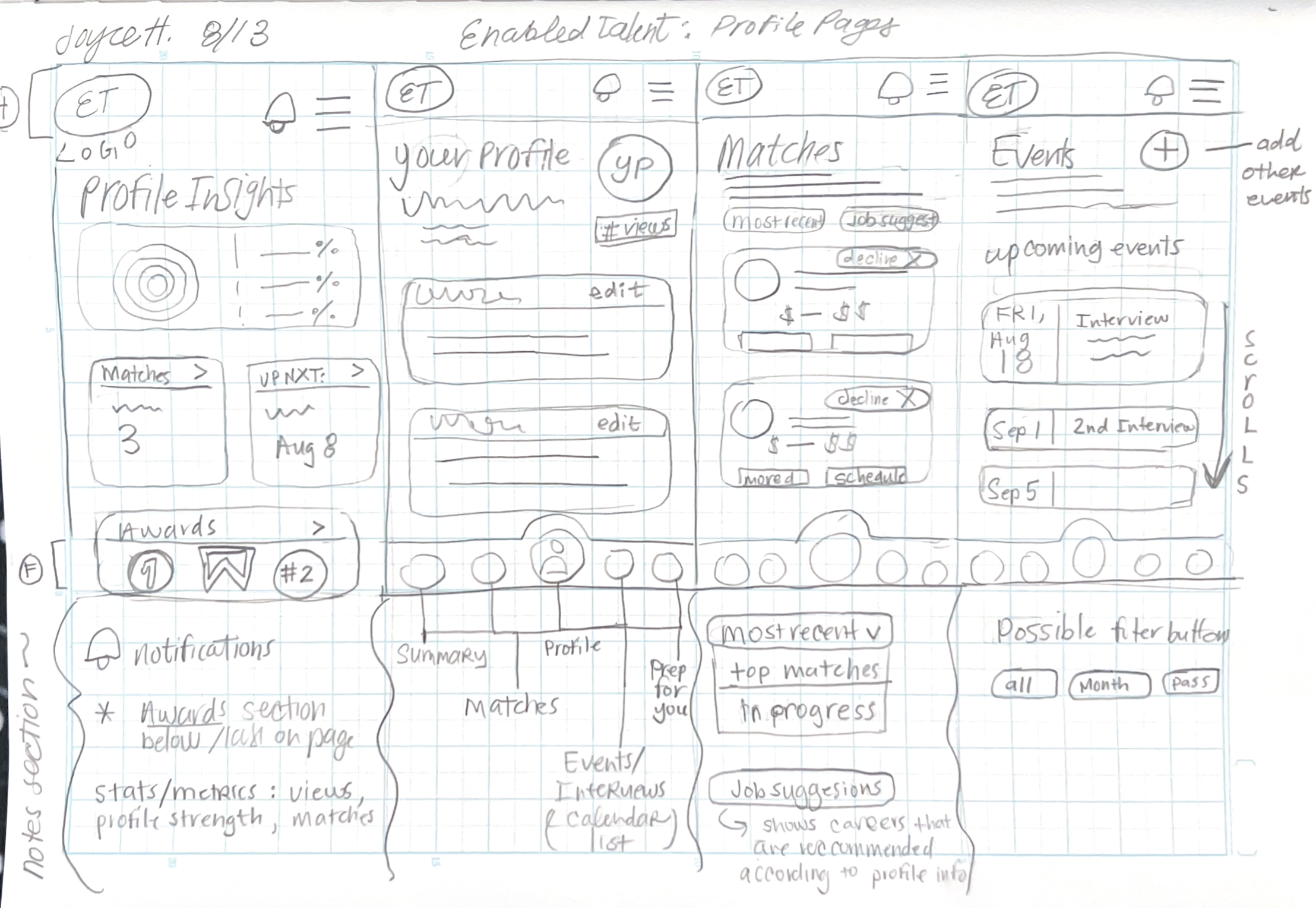
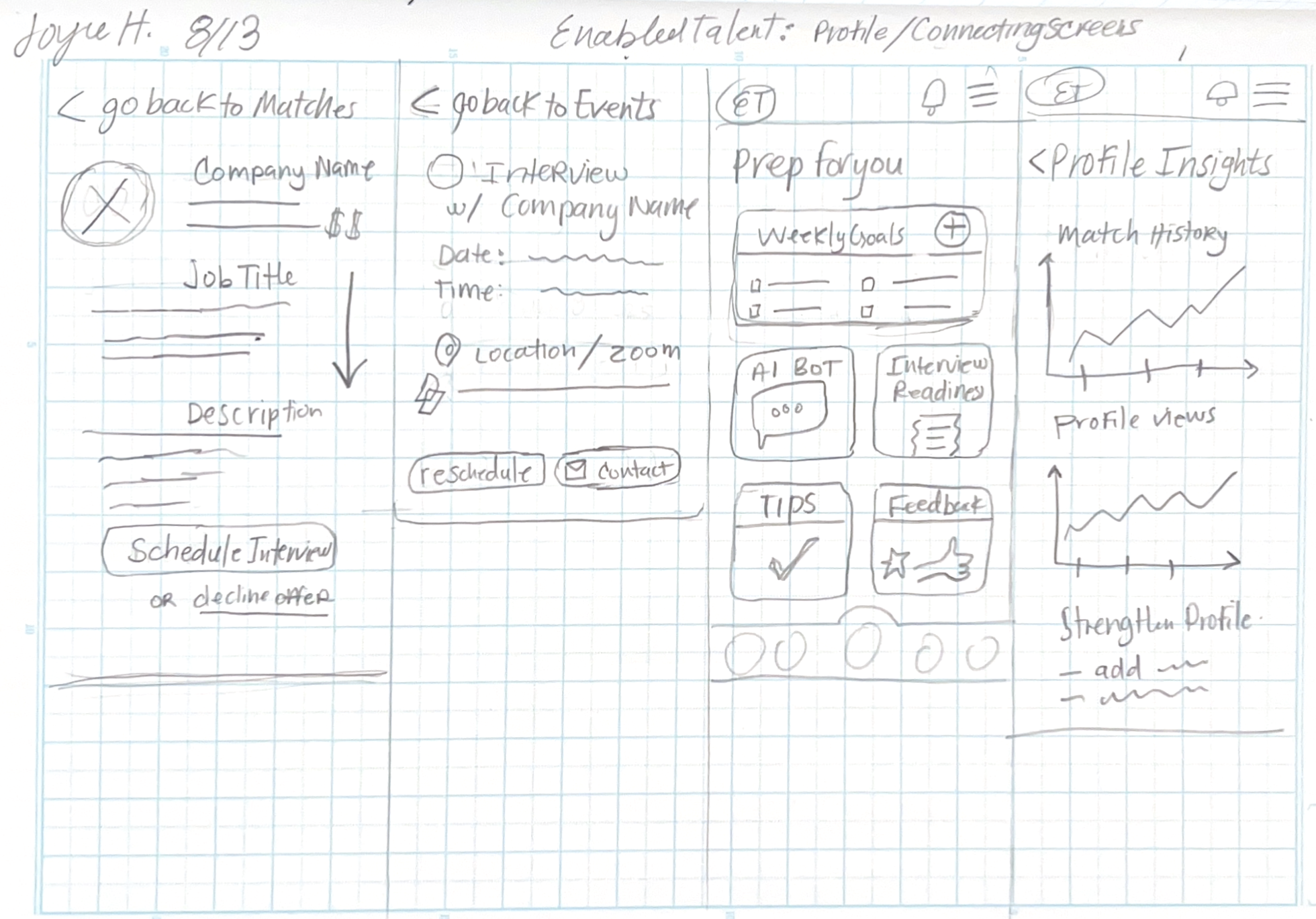
These are sketches of what the Profile Insights, Profile, Matches Page, and Scheduling Interview screens
These show how matches would look like and more on what profile insights would look like
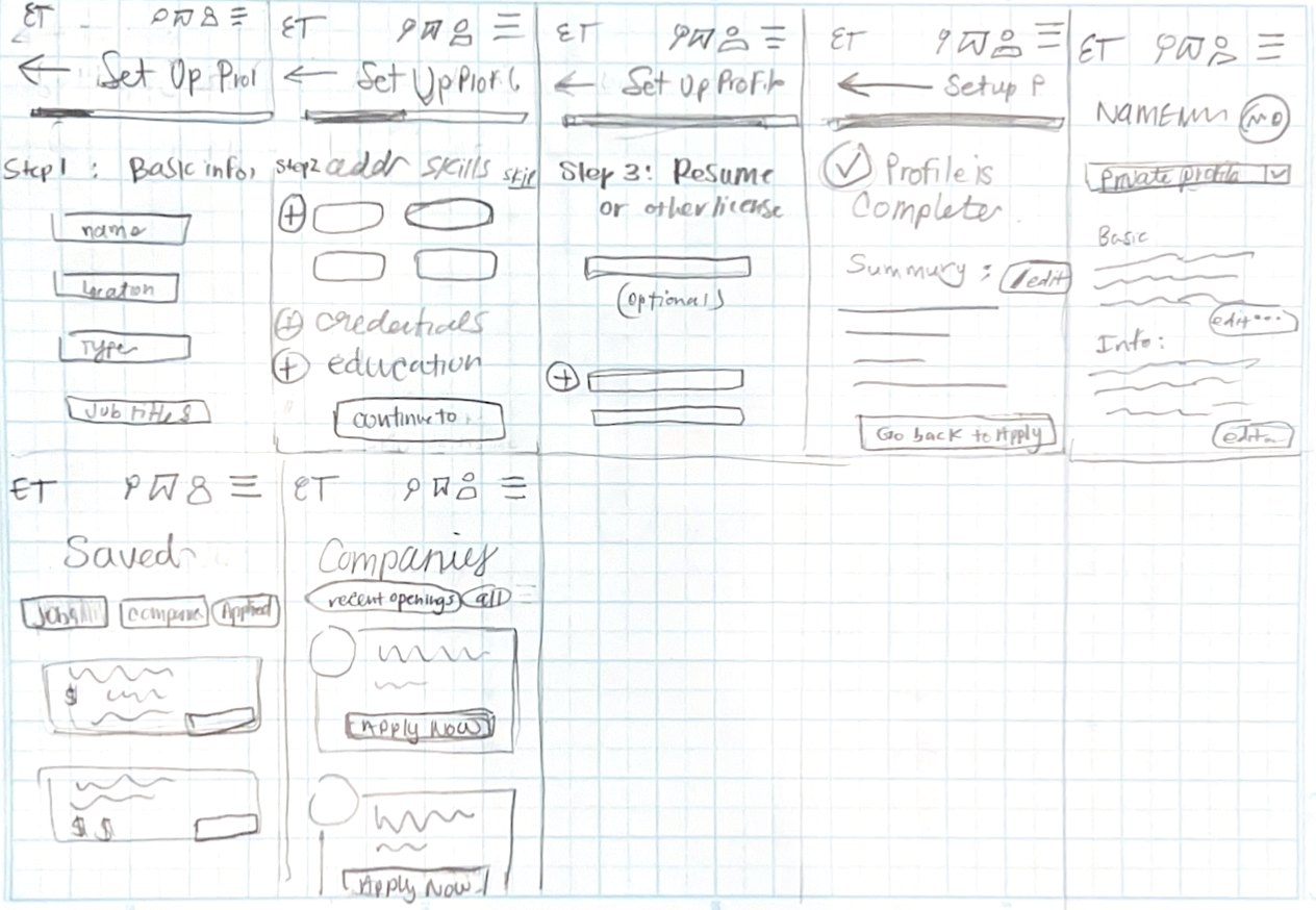
These sketches are on how onboarding would be.

These sketches are on how the sign up onboarding portion would look like
Site Map and User Flows

At this point of our design process…
The site map and user flows gave us a better idea on how our mobile app will be structured and how users will go through different flows.
We used our competitor analysis, user interviews, and contextual research to create our mappings.
After reviewing our sketches and site mappings with the client, there was a change in direction
Initial direction: We would be designing a job listing platform that will allow users to choose their jobs by manually searching for their preferences.
New direction: This job platform will not be an ordinary job listing site, the employers will post jobs and will select from list of qualified job seekers to get matched and to schedule interview.
Prioritizing Features
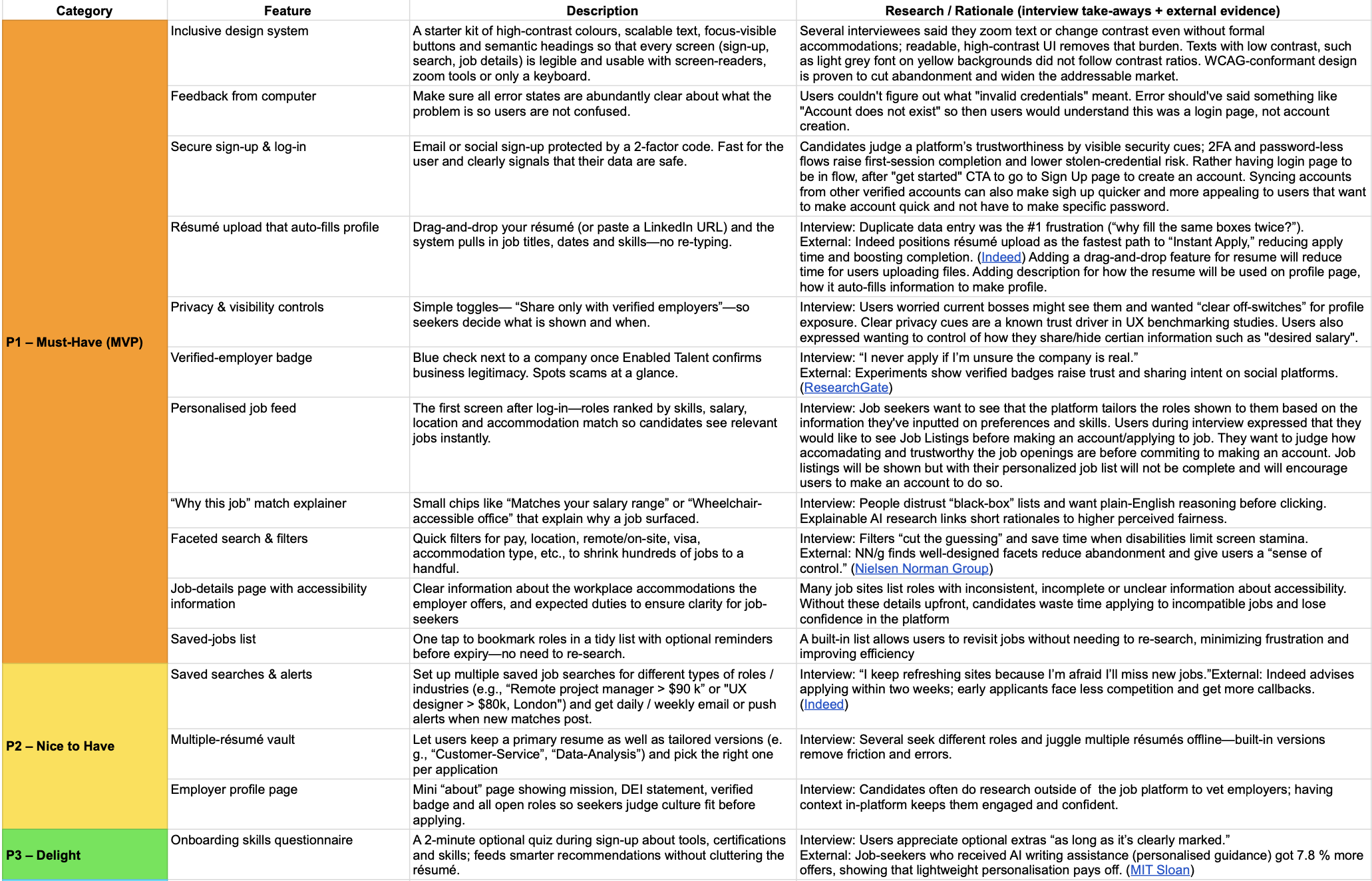
Feature Priorities for Enabled Talent Mobile App
Inclusive design system (WCAG, basic semantic HTML, etc)
Feedback from computer (error, success states)
Resume upload that auto-fills
Secure sign up and log in
Privacy and visibility controls
Personalization of career interests, accommodations and job preferences
Professional profile page (ability to edit, change, add skills)
Resources to user to better their profile/resume (career bot)
Matches/Interview Invites*
Mid-Fi Testing
Objectives: Users were prompted to go through mid-fi prototype with the goal of completing each task with minimal guidance and ease.
Success Metrics:
Average of 4/5 rating for Level of Ease of tasks
Completion rate of 100%
Time on tasks. Goal to have task 3-5 minutes for onboarding
Participants: 5 Individuals. Random and 2 individuals who had done initial user interviews.

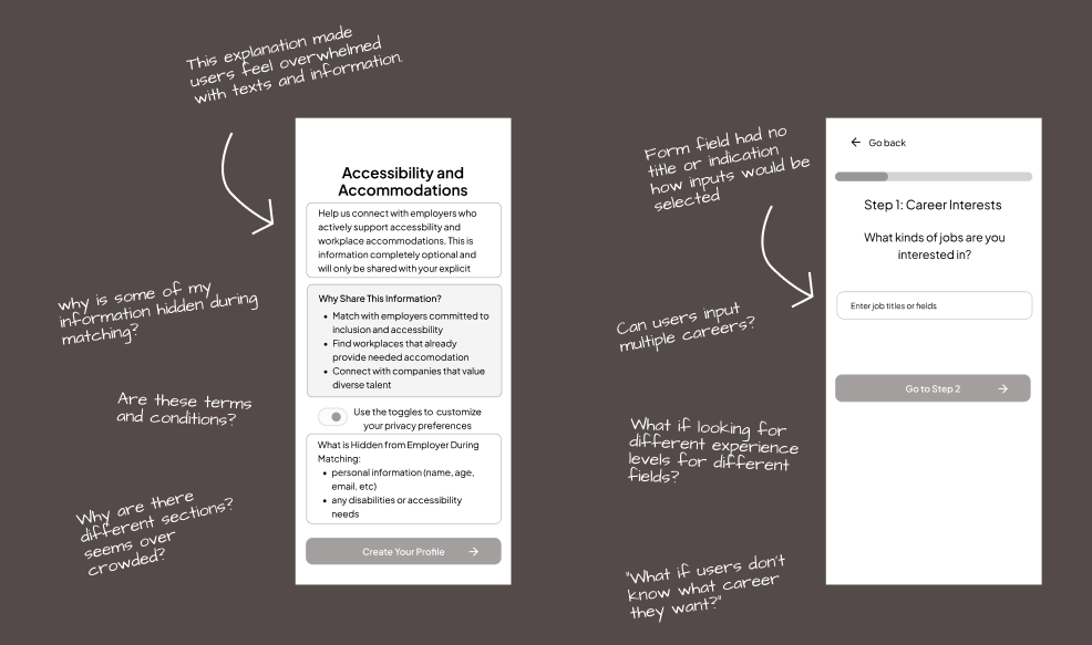
Mid-Fi User Testing Results
User Agency and Control
Need more opportunities for control of what information is inputted, skipped, or hidden or not.
Clarity and Transparency
Need more explanation on how app works, how profile strength is increased or based on.
Onboarding Experience
Steps on onboarding can be condensed, removed.
Engagement Beyond Job Matching
Feedback and Iteration Loops
When users are “not interested” need explanation why for refining algorithm.
Trust, Safety and Accessibility
Asking about accommodations in a simple clear way
Need privacy disclaimers on protection of information.

Hi-Fi Wireframes
The Top Revisions Post-Mid-Fi Testing
Onboarding Explanation, and Condensing Forms.
Accommodation Selection
Profile Page with Skills Section
Interview Acceptance and Rejection Flows
CareerBot Integration for Job Preparation
My Individual Contribution:
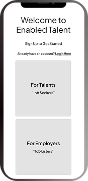
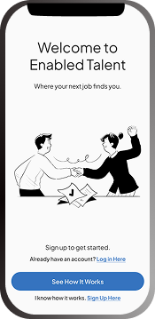
Sign Up Flow
Onboarding Forms
Profile Page
Adding Skills from Profile Flow
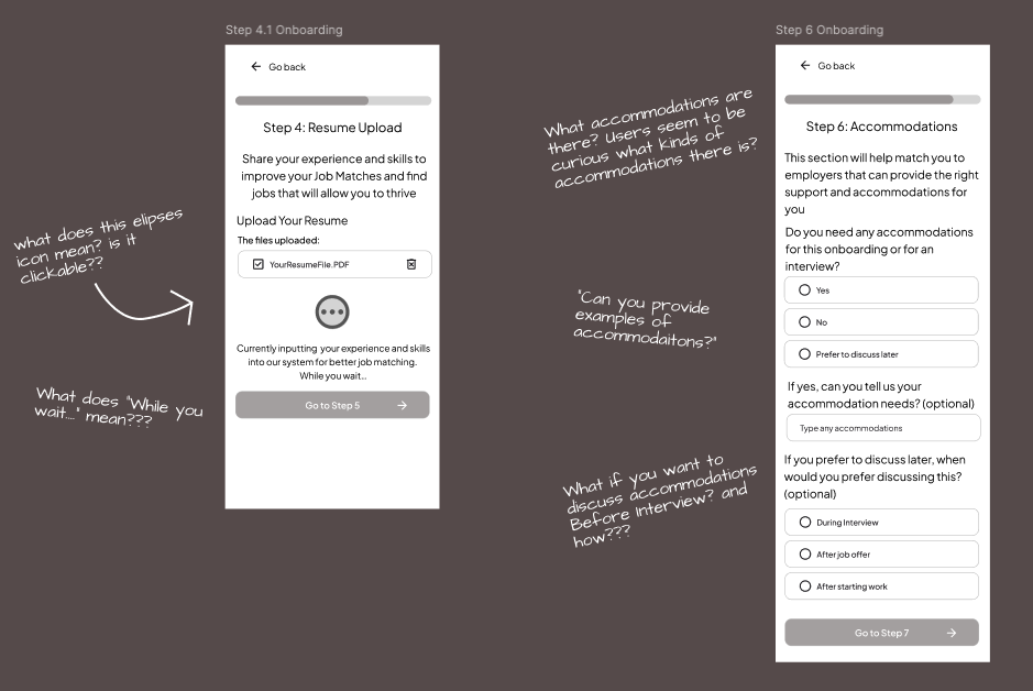
Hi-Fi User Testing
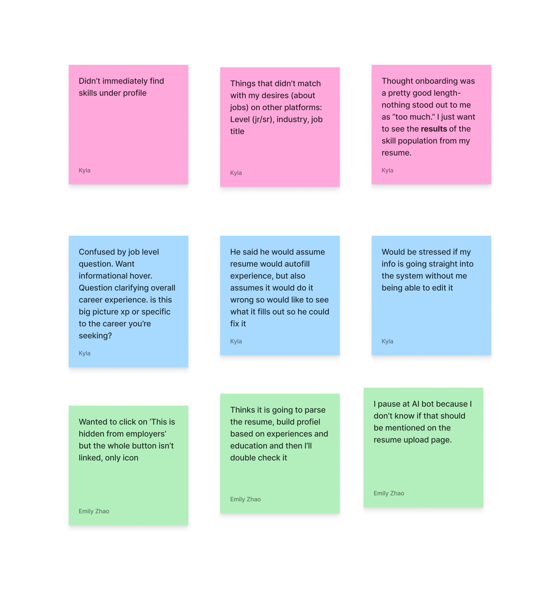
Hi-Fi User Testing Affinity Notes
UI and Consistency
Need to make sure capitalization, spacing, and color usage are standardized
Clarity and Transparency
Need more explanation on how resume information is being used and parsed.
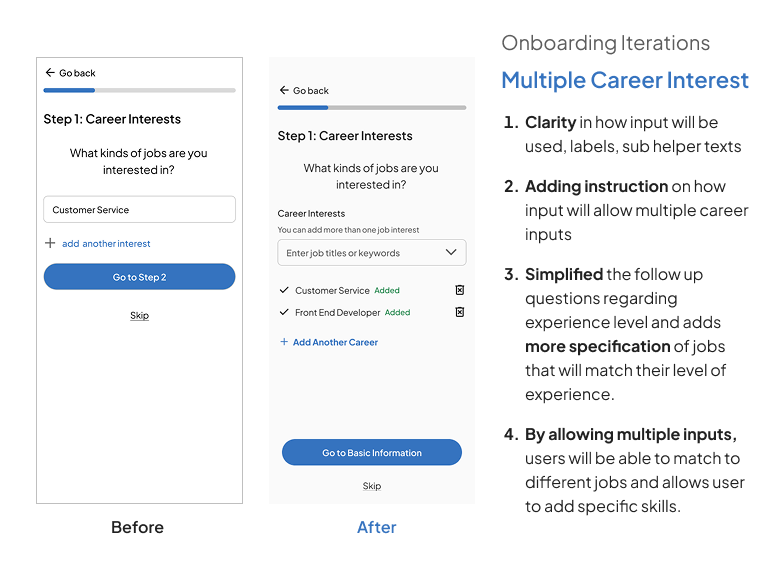
Onboarding Experience
Need to solve for multiple job titles, and career levels.
Engagement Beyond Job Matching
The chat bot should allow for more interaction and integration with the platform and enhancing their sills
Trust, Safety and Accessibility
Clarifying privacy information and profile, who will see information?

Creating a more descriptive resume upload

Allowing for more simplified and inclusive accommodation selections
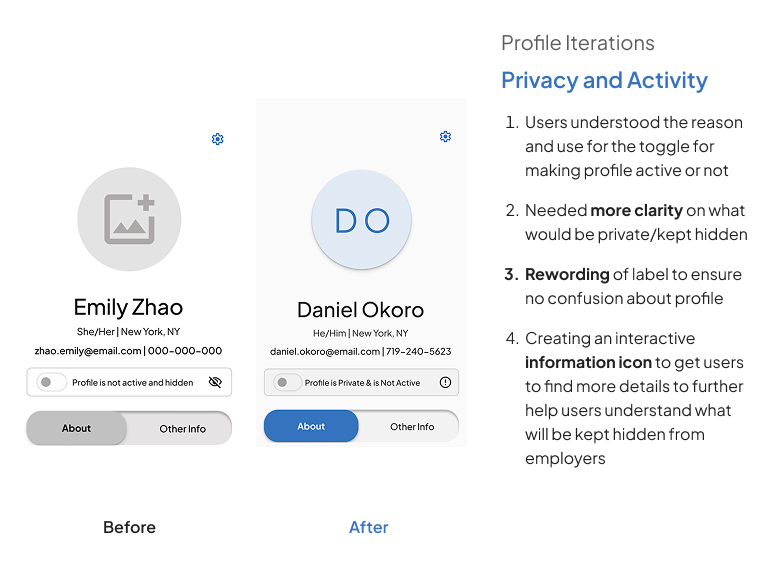
Creating profile privacy descriptions and clarity

Reordering of profile sections on About page and More Info page
Accessibility Annotations

Click to View Full Accessibility Annotations. My extra delegated task was to create the accessibility hand off annotations for the client’s developers.
What I learned from creating accessible annotations…
This was a big challenge for me to learn on my own, and using many different resources (youtube tutorials, W3 standards, CVS UI kit, etc.)
I learned a basic understanding of how the backend work of the developers is essential for accessibility
I learned the fundamentals of what are the differences of:
buttons, inputs forms, links, decorative vs. contextual images, and tab vs reading order.
_____________________________________________________________
Overall, I enjoyed all that I learned and I feel way more confident on creating more accessible designs and where I can go to find helpful resources.
My Final Reflections
I believe that this project has allowed my team and I to grow as UX designers, and we have more confidence with working, and presenting with a client than we did at the beginning
Accessibility standards were new to my team and this project really helped strengthen our understanding and helped us learn to be more inclusive with our designs going forward.
We learned as a team to work together and use our individual strengths to delegate what each of us were comfortable doing.
This project was overall so vital for my team and I in our UX design learning journey because grew so much throughout the process. This was a great experience for all of us with working together and with an actual client. I am very proud of the product that we created together.
Our Challenges
We had a slight change in direction at the mid point of our design process. My team and I were able to adapt from the change in direction, and was able to communicate those changes with the client in a timely manner.
An unexpected challenge was learning on our own in depth about WCAG standards and being able to translate that into our work.
We had an extension in our project, due to needing more time to complete our hi-fi product. We learned that we needed to prioritize more towards the end and to focus on the most needed features for the project.
We experienced different time zones across our team and client’s team. We were able to communicate and schedule accordingly with our team members to get tasks completed.
Next Steps…
Enable interview scheduling in-app
All users indicated this would be essential to controlling their job search and making sure they receive responses, reduce anxiety around ‘ghosting’
Developing calendar integrations so users can easily export to Google / Apple calendar and/or see potential conflicts with their current schedule before scheduling in-app
Testing accessibility beyond WCAG
Since we lacked the target demographic for this project, getting more data from more individuals would be best to learn more about the screen reader/keyboard navigating community.
Having more research and user test on individuals with low-vision and screen reader/keyboard navigating users to validate the typography, contrast, focus order and information density.