Cafe Hana | Concept Responsive Website Redesign
Redesign of Local Cafe and Building Brand Identity
I chose Cafe Hana to work on their website to improve their online discoverability and building their brand for their customers. I am not affiliated or employed by the business. This redesign is for my practice and to showcase my design skills. I did reach out to the business but at that time the business was not open to collaborating.
Role: sole UX designer
Timeline: 75 hours
Tools: Figma, Otter ai, Gpt (image generations), Adobe Illustrator

Problem Statement
There is a gap between online discovery experience and actual in person at cafes. Customers often struggle to find clear, organized menus and strong sense of cafes brand identity online. Without a mobile friendly platform, it becomes difficult for users to navigate the site or place orders on phones easily, leading to disconnect between expectations and reality.


What Are The Goals?
Business Goals
To increase satisfaction of users by creating easy mobile friendly website that provides clear information
90-95% positive reviews from online platforms.
To increase website traffic and visits
30% more website visitors and online orders.
To increase discoverability and engagements.
50% more engagement with website through other social media channels such as, instagram, tik tok and mentions/tags.
Users Goals
To be able to find reliable information of cafe such as, location, hours, menu, and ordering options.
To be able to understand the cafe’s setting, background and overall ambiance.
To have ease navigating through the website to order online.

User Research
Research Goal
The research goal is to understand the common needs of users discovering cafes online, what they are looking for and what is important to them when viewing cafe information and mobile ordering.
Research Methods
User Survey- To find out reasons users go to cafes, and how often they go.
Competitor Analysis- for UI and structure research.
User Interviews- for in depth discussion of their experiences with searching and going to cafes.
Research Participants
5 total participants.
Ages 18 years and up.
At least gone to cafe 1-2 times before.
Key Findings
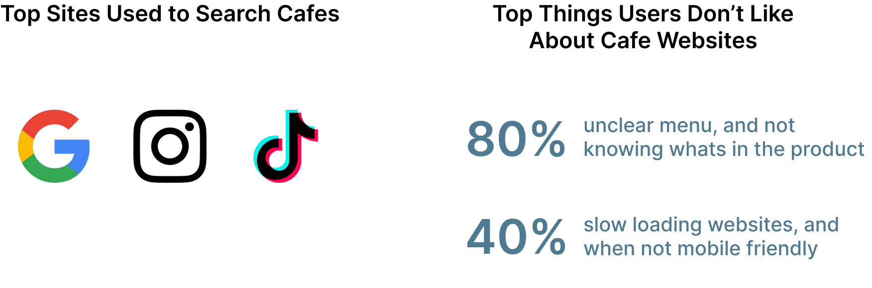
Users mainly used Google Reviews, Instagram, and Tiktok to gather information of cafes but mention how the searches vary on what is shown, and lack vital information at times.
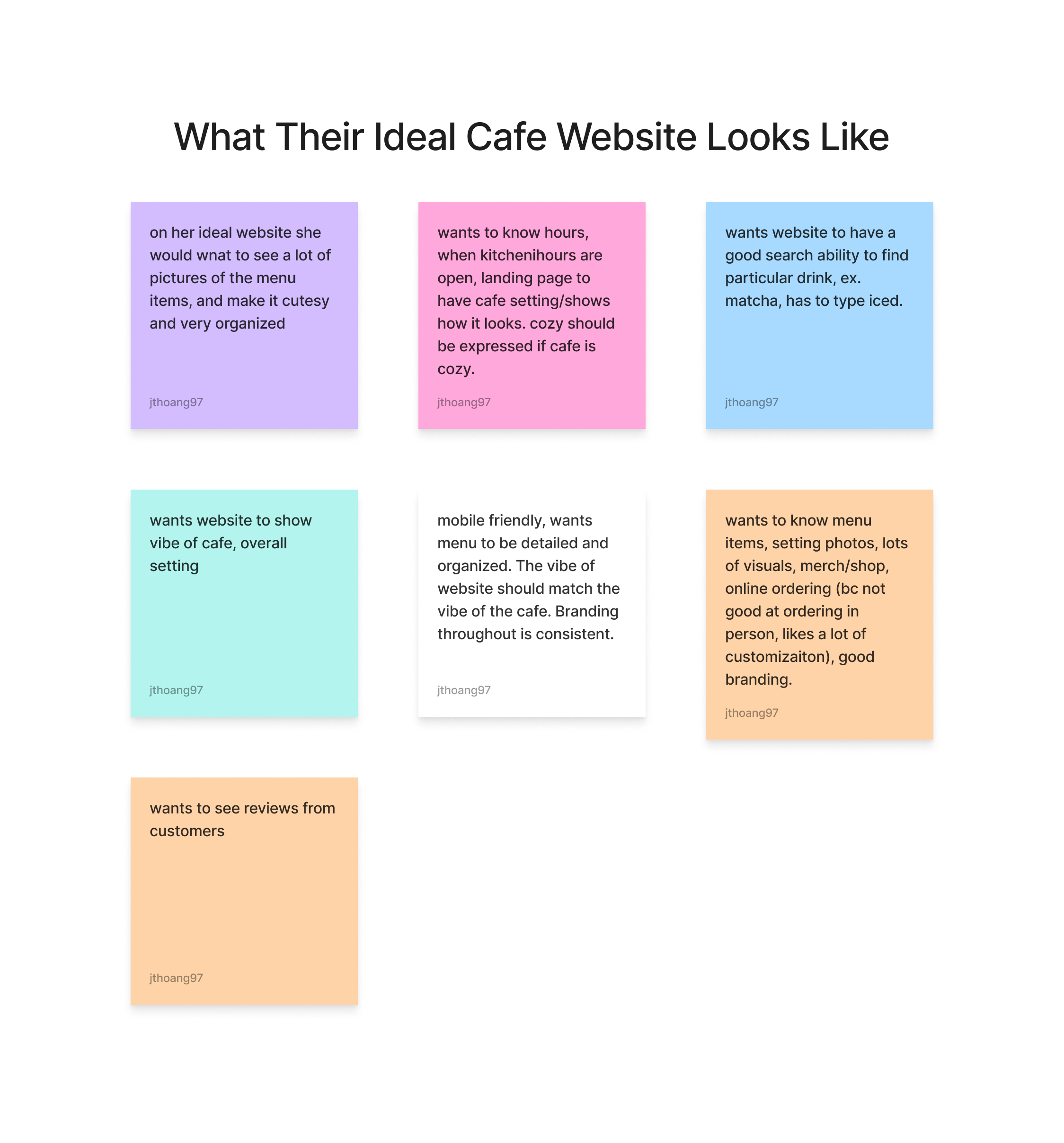
Users say they view websites for the cafe’s ambiance, and pictures of products, location and hours, menu, and to quickly find ordering options.
The users ideal website will match the cafes vibe, have organized mobile friendly menu and option for mobile ordering.

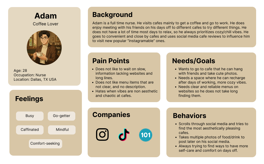
Persona of Individual who appreciates the details.
Persona of individual who likes quick but trendy cafes.
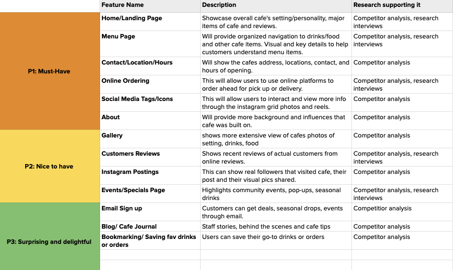
Cafe Hana Features Set
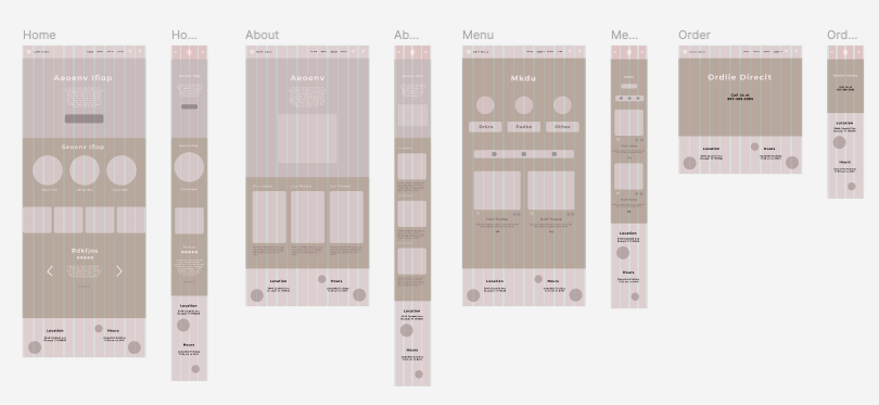
Lo-Fi Wireframes
Prioritization and Ideation
User Needs
Users need to understand the cafe’s atmosphere, vibe, and cultural influences through the website, and to decide if it aligns with their cafe needs.
Users need to view the menu easily and visually, that can facilitate quick decisions or scrolling on the phone.
Users need to have a quick and seamless way to order online.
Features Set
The feature set I made set the priorities on what I was going to focus on for this project. The main things I needed to prioritize were:
Landing page and About Page
Menu page, and Categories Sorting
Contact, Hours, Location
Online Ordering
Social Media Tags, Online Reviews
Wireframing Lo-Fi & User Testing
Reflection from User Testing
After doing a user test over my lo-fi wireframes I found gaps in my design that need to be fix for the final versions. The main critiques were on the menu page itself. There were a lot to consider besides the layout for the menu page, such as what cafe food and drink items and the different categories for the items. In the lo-fi I need to showcase more layouts that incorporate how I would organize the menu items that users can navigate easily through.
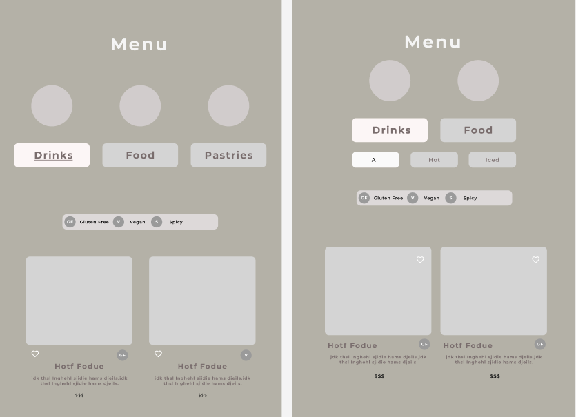
3. Before and After of Menu Page
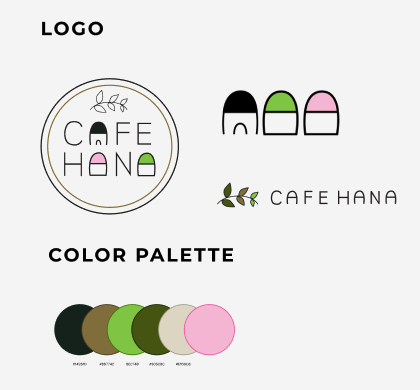
4. Redesigned logos and branding colors
Design and Iterations
My Iterations From My Lo-fi version:
Created a better organized menu page by creating two main sub pages, Drinks and Food. Also created quick filter buttons that will allow for more specific needs such as, hot or iced, and vegetarian or gluten free options.
Created a more weighted footer with more navigating options and social tags to encourages more action to either navigate to other pages, see location/hours, or visit social media for more details.
Branding and Logo Design
I took my research from my competitive analysis to find inspiration on how cafes incorporate their cultural influences into their branding. I also took the Cafe Hana’s existing website to draw more inspiration on what they represent and what they think is important.
I wanted to keep the typography similar to the font they chose on their logo. I choose Montserrat as the main font, and changed the spacing to match their spaced out wordings.
The colors were chosen from their colors from their current website and from the ingredients they use in their products, matcha and strawberries (fruits).

User Testing Hi-Fi Version
Objectives
To test mobile screens of cafe’s website. The user test will give more insight on how users flow through the different navigations, finding menu, going to order online and ordering something off of the online platform.
Participants and Methods
5 random participants.
All tests were done through google meet, and virtually moderated.
Success Metrics
At least 90% of users will complete all key tasks.
At least 90% of users will be able to find the menu and identify at least 1 dietary symbol.
80% of users will rate the ease of 8-10 or higher. (10 being the easiest)

My Priority Iterations
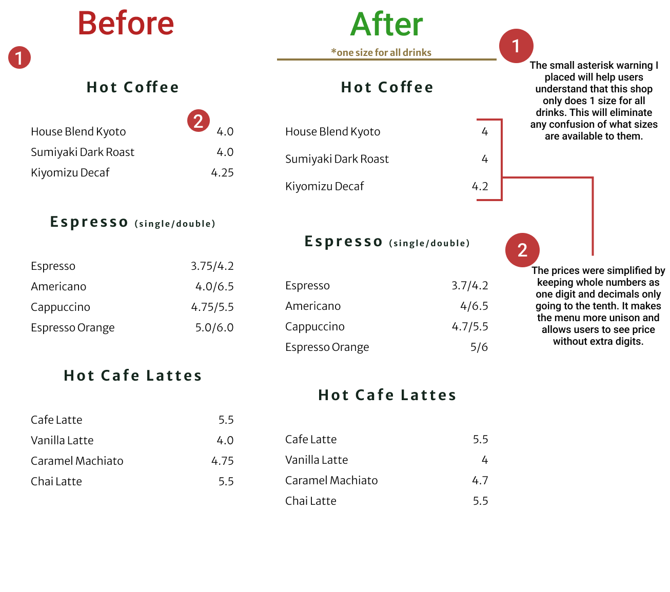
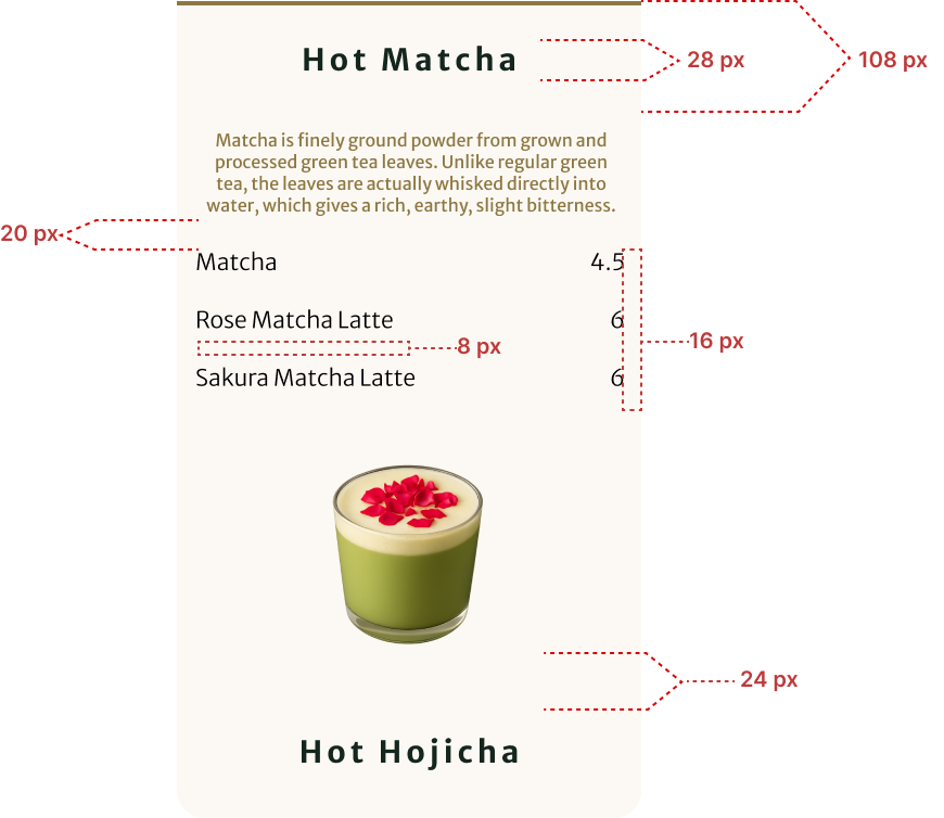
Making the menu have more clarity on the pricing and sizes. Users found it confusing that some prices had two different prices and not knowing if it was related to size or for hot/iced.
Creating more consistent spacing for the overall website. This will allow for better readability and comprehension for users to understand content and the hierarchy of items.
Creating a more direct way for users to quickly find menu items within webpages, such as order button at top of header, or the “View Full Menu” CTA to be placed higher on the page to give better attention to key actions.


My Reflection
What worked well?
I was able to organize my work better for this project because of the other projects I had done prior and learning from my mistakes.
My components were all made before piecing together whole pages and sections.
The use of auto-layout was done to help keep all spacing consistent throughout screens.
What would I do differently next time?
Since I was not able to collaborate with the actual clients on this website redesign I did not have the opportunity to get client feedback and their specific expectations for the website. I think next time I would like to reach out and spend more time finding a client that is willing to work with me in order to get that real client experience.
I will work on a more thorough lo-fi version to have more feedback from my first user testing and to allow for better design for my Hi-Fi user testing.
What did I learn as a designer?
I learned that sticking to a timeline really helps keep me focused on the priority tasks for this project. I created a project timeline prior to starting and it really helped me stay on track and spend less time on minor details.
I found that a lot of my UX design learning journey is all about finding resources to reduce time spent on things such as photo retrievals for my visuals of food/drinks on menu. I used AI to create prompts to create images of menu items and it quickly generated exactly what I needed for the page and reduced the time I would have spent looking and editing different photos.